Learnings from a Product Shoot

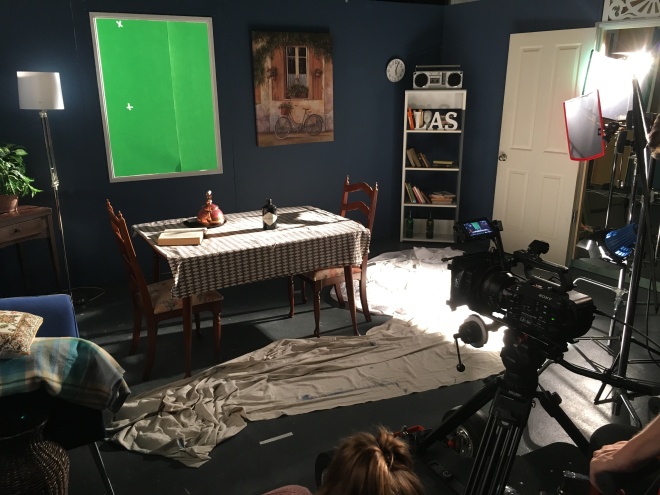
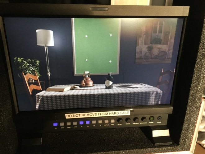
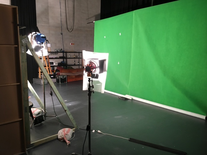
We filmed a product shoot! The idea behind the project was to make a 15-second spot which either sells a particular product or sells the idea and feeling that the product show represents. However, more than an exercise in learning how to advertise, it was an exercise in lighting and making an object look as great as we possibly could. Foolishly, the object that we chose to showcase, mostly at my insistence, was a snowglobe. If you don’t understand why this was a brave and foolish decision, then you are not alone, because neither did we. Or should I say neither did I, because, as the director of photography, the problems that we encountered were almost solely in my department of camera and lighting.

I honestly didn’t think that our TVC would take us as long as it did to shoot. I realised that some commercials take quite a long time to film, but I was under the impression that most were handily shot within a day, and were often much closer to a half day project. I failed to take into account how difficult making the light dynamic and interesting on a mostly still image would be, especially given that I’m not really amazing at creating interesting and dynamic lighting setups. I’m confident with designing basic lighting setups, and can set up lights, but designing complicated lighting setups is a bit beyond me, just because I don’t understand how it all works and fits together, and the effects that each light has on the image recorded, but this is something I’m working on improving. Based on this lack of understanding, I failed to realise just how difficult lighting a spherical glass object would be, even though I did some preliminary research into the topic. Furthermore, we did a test shoot a couple days before the actual shoot, and even in the space of a few hours of messing about with lighting the snow globe for camera for the first time, I learned a lot about how the globe reflects light and colour from every angle. Doing a test shoot was a massive assistance to me in making the actual setup much easier and run smoother, but even so, the actual shoot went much longer and was much more intricate than I had thought it would be. With the help of industry professionals who were there to help us make everything look amazing, we eventually got a lighting setup that we all agreed was good enough, given our alarming lack of time and therefore need to rush a bit towards the end of the day. However, this setup that we ended up with was very different to what I originally had planned to execute for the day.Better, certainly, but also very different, further highlighting my relative inexperience at creating these complex lighting setups.

stock-photo-christmas-snow-globe-snowflake-close-up-230824576 One of the images we used as our original inspiration. Closer to the original concept than what we ended up creating.


I’m choosing to look at this as a good thing, though. Now that I’m acutely aware of where I most need to improve, I can make sure to improve it. With specific regards to lighting and designing lighting setups, there are several different ways I can see to improve my practice. There is always the option of book learning, of study and research and learning technical specifications of lights and cameras and how these interact in different situations to create different effects. Which is totally viable, and a definite starting point, but it’s not really something that really gets me enthused to try it, which is probably just a personal bias against research. The other option I see which seems a lot more fun and interesting, and is something I think I would learn a lot from regardless of the actual outcome, is to actually go out with lights and try to create all sorts of different effects and aesthetics. This is what I enjoy doing anyway, messing about with different equipment setups just to see what would happen, more or less. The potential problem of this approach is not only that transporting the lights around is difficult and time-consuming (lights in cases take up quite a lot of room and can be quite heavy), and there’s no real guarantee that you are going to learn anything particularly useful after all the effort you put in. Despite this, it’s still the way I would prefer to go because I feel like anything that I do learn or discover will stay with me a lot better if I’m physically creating it, not just reading it off a page or website.

As a group, we made the choice to have the camera pan across the snow globe, once along the top of the globe and another along the base. We also elected for the pan to move one way along the base and opposite way along the globe, which we chose to increase interest and make the globe appear more dynamic and in motion. This choice is something that has been questioned by some of the people who have seen the finalised product but is a decision that I stand behind. Not just blindly as well, we did test out options in the editing room of both the two pans going opposite ways and the two pans going opposite ways, and as a group decided that the going opposite ways were more aesthetically appealing.

snow-globe-winter-fir-tree Another reference image, still close to the original Winter Wonderland theme we envisioned before reconsidering.


We chose the overall green and red colour scheme of the spot to represent and intensify the feeling of Christmas that the globe enjoys. The surface that the globe sits on was decided to be snow to capture a sense of wonder and magic that seems inherent with a white Christmas, but included the presents and Christmas tree with baubles and fairy lights, in the foreground and background respectively, to keep the situation relevant to Australians like us, as we don’t experience white Christmases. The fairy lights provide more interest to the background and play well with the shining and sparkling baubles on the tree as well as all being situated around the snow globe in the frame, with only black curtain behind the globe in order to highlight the ‘snow’ falling in the globe, and not obfuscate it or lose details in an overly busy frame. Finally, in post we added 2 different layers of snow falling outside of the globe, with one layer placed ‘in front’ of the globe and one ‘behind’. The idea behind this was to add depth to the frame, add more movement to the shots, and to enhance the feeling of the ‘winter wonderland’ aesthetic that we were going for. I think that this is the part of the composition that works best, and really adds a great deal to the production value and the aesthetic of the shot, and I have to commend our editor for the work he put in to learn how to create that effect and in implementing it.

snowglobes-11659 Now we’re getting closer to the final product, but not Christmas related enough for us.


Honestly most of the problems we had stemmed from a lack of time, so if we could have secured a longer time period (like an additional ~2-3 hours) to complete the filming in, many of our problems could have been resolved to a higher standard. Another issue we ran into was the camera we chose to use did not have significant slow motion capability or high frame rate recording capability, so a limiting factor for us became the speed that the ‘snow’ in the globe settled,  which only took a couple of seconds each time it was disturbed. Also, even during our test shoot we didn’t test shooting with the macro lens, and so only discovered on the real shoot that those shots looked awful and so were unusable in our final result. A further thing we should have done during our test shoot was practiced, refined and improved the method we used to shake up the snow in the globe, and so not ended up with several takes which were unusable because the globe was facing a different direction to previous takes, or the snow in the globe was not disturbed or shaken up enough to create interest or effect. Mostly it came down to not treating our test shoot as exactly the same as our actual shoot because all the things we didn’t take into account for the test shoot showed up as problems for the real one. The final issue that caused us any major annoyance was we were really wishing all the way through the shoot that we had brought with us a single large enough piece of poly to create the white outline effect on the glass, instead of ramshackling together what poly we had, which gave an uneven and incomplete outline of sheen around the edge of the globe. The reason we didn’t is that this was not the way I had originally planned to light the globe, and so we were just unprepared when we were told that the single large piece of poly is the way it’s done.

img_9989 Now this, this is almost as close as we came via reference image. The main differences we aimed for was looking less busy inside the globe itself and more things populating the foreground.


Overall, this project is something that I am quite proud of and impressed with, because I think that we did a good job with what we chose to do, despite coming into the project without really knowing what we were getting into. The final product that we ended up with is definitely not perfect, but what we ended up releasing is something that I am definitely pretty happy with, particularly the framing, lighting and camerawork, the part I did. More than just ending up with a final product to show off, the whole experience was a very informative and I feel I learned a lot from it, particularly about lighting, but also about beauty shots in general. I’m glad that I took on this project and chose to highlight a difficult object to light because I think that is why I learned all that I did from the exercise. If it had been really easy and I could have done it all perfectly with no help, what would the point of the exercise have been? If this is something that interests you at all, I encourage you to give it a go and see what you learn through the process. I promise that it’s well worth the effort!

Learnings from a Product Shoot

Green Screens and Post Learning

So semi-recently I was involved with a very small shoot involving a green screen, designed to teach us about green screens, their setup, lighting involved and all the post production elements required in order to replace the green screen with the desired image. More interestingly, the shot we had to composite a plate image into, the one with the green screen part to it, was a dolly shot (a moving shot), which meant that the set was moving at a different rate to the green screen, and so this differential needed to be accommodated for in post.

4

The first step in this process is, of course, the setup of both the set and the green screen. The set was set up with a ‘window’, behind which a green screen was set up about 5 meters further back, and around which there could be no green objects so that they did not interfere with the key that would be necessary for the compositing to take place. Additionally, the green screen had to be large enough to totally fill the window at all times, so the limits of the shot movement had to be settled upon first. This was a bit of a feedback loop, however, as there was a limit to the size that the green screen could be, which limited which movements were possible. Once these limits were decided and both the set and green screen were set up, the lighting had to be adjusted on both to make sure the video at the end was of a high quality. Lighting the set is a problem in and of itself, but this problem was not affected by the inclusion of the green screen. However, we did have to make sure that the lighting on the set, particularly the time of day and direction of the lighting, was consistent with the lighting that would exist in the plate shot (the shot superimposed onto the green screen), which we shot later that afternoon. The lighting of the green screen itself was an issue that I had not come across before, so it was lucky there were experts on hand teaching us. Turns out, a green screen should be lit very flatly, so that the entire screen is a single shade of green, with as little fluctuation or noise as possible. This is so the key (the selecting of the green colour to be digitally removed from the shot) is uniform and of a higher quality, or accuracy, meaning that there are no green lines around the outside of everything or green sparkles throughout that we were compositing into the shot.

1

When you set up a green screen, however, you don’t just set up a green screen. You also have to place the green screen tracking markers, small marks or crosses of a different colour so that the movement of the screen itself can be seen relative to the movement of the foreground set. This is a largely ‘invisible’ part of the process, as it is one of the last things done before the shot is taken, and is never seen outside of the post-production process, and perhaps as a result of this, it was a part of the process which I didn’t know about. The purpose of these tracking markers, if you were wondering, is to give reference to how fast the movement of the green screen was in relation to the movement of the set. The difference between these 2 speeds will increase as the distance between the set and green screen increases. Another way of saying that is that the further away from the camera the green screen is, the slower it will move, while the set stays at the same speed while it is close to camera. However, the further away from the set the green screen is, the larger it has to be to completely fill the space in the shot it needs to, and the harder it is to light the whole screen evenly. But if the screen is too close, then light from the screen will bounce back into the set, which can both disrupt the lighting setup for the set, and look totally unnatural depending on what the green screen is being replaced with. It’s all a balancing act, and I’m glad that the first time that I encountered these problems was in a controlled exercise, rather than something where the final result was drastically important. There has to be a minimum of 3 tracking markers to create a plane (as in a 2D surface, rather than an aircraft) which moved at a different rate to the plane of the window. The markers were positioned to be as far apart as possible while still all remaining visible at all times in the moving shots. This meant that the marks had to be moved in between different shots, and again, wouldn’t have been something I realised before doing a take and noticing in the frame. It also means that for shots where the camera doesn’t move, these markers become totally redundant. The marks themselves have to be sized big enough to be clearly visible, but not so large as to overpower the green, and had to remain as separate and distinct marks, so can’t overlap in any way.

3

The plate shot seems like the simplest part of this whole process, but as I discovered, there are far more technical consideration for the plate shot that need to be taken into account than I realised. These include that the plate shot has to be shot with the same lens as the green screen shot, and all the details of the green screen camera shot (such as the distance from the camera to the green screen, any angles involved) must be conserved over shots between the green screen and the plate. It makes sense once you think about it because it ensures that the background appears and behaves as it should once it is composited into the shot. However, it’s one of those things that, had I not been in the presence of people that knew what they were doing inside and out, I probably would have forgotten to measure in the first place, and so would have been unable to faithfully recreate these factors, meaning I would end up with a final product that would just look off.

Despite all of these obstacles and challenges involved, life on set actually went really well and it felt like we were able to easily overcome or avoid all of these potential trip ups. This was, of course, due to the fact that we have advanced knowledge sources helping us every step of the way: if we tried to accomplish this on our own without all of this expert help and advice, we would have ended up with a disaster, I have no doubt. It was only because we had experts there helping us that we didn’t have to learn all these lessons the hard way and end up with an absolutely disastrous final product.

2

The actual composite was the part where we were left on our own a lot more, meaning it felt a lot more challenging. We still did get some expert pointers but were left more on our own to encounter any problems that showed up and learn first hand what the point of all the precautions we took on set were for. And even with the help we got, problems did show up. Because we recorded in cinema lock, the colour space was compressed and the LUT we tried to use to correct this didn’t work perfectly, causing a lot more colour grading to be done. Additionally, the colour grade was difficult to get to the stage where the colours popped without creating a huge amount of noise in the green of the green screen. The noise then makes it difficult to get a decent key off the green, so then the key has to be expanded and includes all other green objects in the room, making it so that more layers have to be added to the composition to add a mask over the top, so that only the green of the green screen is replaced by the plate shot. Despite this, I can’t even imagine all the problems that would have shown up if we hadn’t had expert help. 

Overall this project was very interesting to be a part of because I learned a lot more than I thought I would. It gave me an appreciation of all the difficulties involved in green screening that I didn’t know about, and I already thought it seemed difficult. I’m glad then that I did this exercise because, for me, the best way of learning is doing and seeing the process done, seeing the mistakes be made (or making them), or seeing them purposefully avoided. It helps me learn far more than just being told “a green screen needs to be lit flatly”, to see a green screen be lit flatly and understand the reason why. I fully recommend you to practice messing around with green screens if you have the opportunity because it is very interesting and different filming experience. If you do, however, make sure you follow the process through post-production as well, because that is where a lot of the learning takes place, and you see all the effects of the measures you take on set. Well worth the effort.

Green Screens and Post Learning

Experimental Filming – Full

Over the past week or so, I have been planning and also filming and editing a short, experimental film together in a group of four. From conceptualisation to screening, the entire process took place over the course of 7 days, which is a fast turnaround and doesn’t give a huge amount of flexibility in the ability to do pickups, nor leave a huge amount of time for post production. The film went from being nothing but a concept in my head to having a rough cut within a single day, taking about 7 hours in total. The day felt a lot longer than that up until the point were rushing through trying to get a finished project uploaded, where it felt like we hadn’t had any time at all. I loved every minute of it. A stressful day to be certain, but I wouldn’t want it any other way. This was my directorial debut, the first media to ever come out with me listed as the director, and was, as such, a project incomparable for me.

Before I get into a lot of behind the scene type talk and so you understand the context, watch the 2-minute film:


Being the director of this project and being in charge of the whole production was easily both at once my favourite and least favourite position on a film that I’ve ever held, and it’s all for the same reason: as director, it all ultimately falls to me. The director is in control of the production and the ultimate arbiter of taste, meaning the final product is an expression of the director’s. This is especially true for me in the case of this film because in addition to being the director and teller of the story, I also did all the cinematography and lighting as well as crafting the story of the film with help from the others in my crew. Despite all this responsibility, I loved it and greatly enjoyed directing, and will pursue directing again. The biggest trouble I have directing is that sometimes there is a translation issue from what’s in my head to what gets communicated to others. While I love the control and ability to tell the story my way that directing gives me, all the clear and yet concise communication required is something I think that I’m particularly adept at yet. I seem to struggle the most communicating specifics of my wants and wishes with others, but generalities are easy. Again, this problem could be more closely tied to this specific film than to my directing in general, as the entirety of this film is relating abstract concepts to specific objects, and I have no other directing experience of my own to compare to. The director needs to have the vision of the piece (which I did) and to guide the rest of the crew through the creation of this vision (which is where I fell down a little). Some of this is down to practice, certainly, but I also think that there are things I can do to try and improve outside of set as well.

Because this project was an experimental film, I got a glimpse behind the curtain of what the creative process for these less ‘standard’ films could be like. The conversations we were having about this project during its creation were totally different to the conversations I’ve had in any of my other projects. Creative conversations about more traditional narrative films revolve around the characters, their internal motivations and how to get this across on-screen, and around the beats of the story, the arcs involved. Every conversation is about “How does this help the story?” This is not a negative in any way, this is the way it has to be. But with this experimental film, where the story was told entirely symbolically, the conversations were all about “Does this show what we are trying to show?”, along with the ever present fearful “Does our meaning come across at all?” This is something I haven’t really appreciated before, as the projects I have been a part of before this one had fairly literal stories. The transfer from the question of “How can we best tell this story?” to “Can we tell this story?” is not an insignificant one, and I think one that will become more and more important to carefully consider as I work on more and more complicated stories and methods of telling them. Happily though, in this case, I firmly believe we succeeded in telling the story we set out to. Backing this up, all the feedback that we have received so far on this film has been overwhelmingly positive, and the meaning we were trying to express has been picked up by the audience without feeling forced or overbearing.

The main point that I picked up on from this process is that even when the style of film is changed, and the literal is ignored in favour of the symbolic, audiences are still capable of picking up on the meanings intrinsic to the film. That even though the style of the film may be fluid and unusual compared to what the audience is used to seeing, that doesn’t automatically make the film impossible to watch, enjoy or understand. Style is something that can be messed around with and does not have to be secondary to narrative in all respects. Narrative is not the be-all and end-all of all films. The other key point which I had driven home to me is that an audience is intelligent enough to understand symbolism within films and can be trusted to make an interpretation of what they have seen. Maybe this is just the cynic in me, but this was not something I took for granted, and so throughout the whole planning and filming process, I was worried that our meaning would be far too abstract for the audience to catch on. This project showed me that the things that are most important to a director (in this case the symbolism involved in the film and the metaphor itself) will shine through, as they are the things that most time and effort are put into.

There were quite a few films, both feature-length and short, that inspired me in the creation of this short film and influenced the ideas generated, but I’ll list some of the standouts. Primary amongst my inspirations was French new wave cinema (or my generalised understanding of it) especially the films of Jean Luc Godard, the filmmaker of that era whom I have seen the most work of, from which I took a lot of inspiration for the editing style,  pacing and tone, which in turn influenced how I believed the story should be told. ‘The Alphabet’ by David Lynch was another inspiration, from which I took the potential power of using pure symbolism in the film, and experiencing the hold that had. Despite the meaning wasn’t clear upon first viewing in Lynch’s short film did not in any way dissuade the viewer from the knowledge that there was meaning hidden within the piece, and that it was okay to have to decipher the film. The meaning didn’t have to be literal; a very freeing concept once embraced. Finally, Kubrick’s ‘2001: A Space Odyssey’, particularly the pre-man and post-Jupiter segments, the less narrative sections, which proved that meaning could be understandable upon first viewing without detracting from the quality of the work. That is, making something indecipherable was not automatically the same as making something worthwhile.

Some of these inspirations come across in simple ways: I think that the editing is reminiscent of the editing of French New Wave cinema, even if the style of film is vastly different. The film is entirely symbolic in order to get across a meaning without being blatantly obvious with the message. The lack of literal elements within the film makes the meaning less clear, but the meaning shines through clearly enough that the audiences we have shown the film to have grasped the meaning without an intense analysis or breakdown required. Additionally, I made the choice to use champagne as the liquid the objects are dropping into as champagne has the air of high class about it. By that, I mean that champagne is seen as a sophisticated drink which is consumed by the successful, who is the prime target of the meaning of the film.

However, despite all of this positive feedback and things I think we did well, it is far from a perfect film, and there are things I believe we could have done better. The objects which we dropped into the champagne could have been more specifically chosen rather than being whatever we had to hand, and so could have been used to add another layer to the story by creating a profile of the person that owned the objects. This is something we tried to take into consideration with the objects that we had, but unfortunately thought of this too late and had to make do with what was available to us, and so it seemed more like trying to shape what we had rather than an intentional element. Additionally, while I like the edit that was presented, I do think that is still some tightening that we could do to really enhance what we have and improve it in a minor way. Finally, while there was reasoning and consideration put into the choice of liquid used, the meaning of using champagne specifically didn’t really come across. While this didn’t stop the whole meaning from translating to the audience, it is a detail that could be pushed to add a further layer to the film as a whole.

Despite these possible improvements, I am very pleased with what we produced in this film, especially considering the limited timeframe involved. As an added bonus, I greatly enjoyed participating in this project and am going to try and use it as a springboard for future projects as well as a learning exercise to use to improve my practice overall, and my directing specifically. For something that seems so simple, it is amazing the amount of depth that could be incorporated into it, and I certainly learned a lot from it.

Experimental Filming – Full